Reading
The myths of colour contrast accessibility. A handful of points which, as the title implies, cover some misconceptions about colour contrast.
There’s a growing demand for designers to make their interfaces accessible to all users. It’s important to accommodate users with disabilities, but there are many myths to color contrast accessibility being perpetuated by misinformed people
…
This article debunks common color contrast accessibility myths and sets the record straight.
There’s bits about grey text, using colour to convey information, and the requirements of AAA, but the one that jumped out to me was about the contrast ratio requirements of interface components.
Interface components have a contrast ratio of 3:1, while text is 4.5:1. Text requires a higher contrast because users need to read it. Interface components don’t require reading and have a lower standard (source).
I don’t know about you but I had no idea this was the case. While it’s probably not going to make a huge difference to the stuff I make, it’s really helpful to know that in some situations (buttons for instance), there’s actually a different threshold for sufficient contrast.
Moving beyond console.log(). 8 Console Methods You Should Use When Debugging JavaScript and Node. Saw a tweet by Addy Osmani that got a bit of traction:
https://twitter.com/addyosmani/status/1191049744962842624
… and that reminded me of this article that I’ve had sat in a tab for a few months.
I’m an unashamed fan of console.log() – my only source of embarrassment around it is that I don’t make more of the other methods. group() is always a good one, but I also like assert() and table(). They’re things that every time I remember them, I think “oh yeah, I should use that in x situation” but then I forget again and revert to a ton of logs. This is my self-prompt to not forget.

About the re-opening of this piece of history…
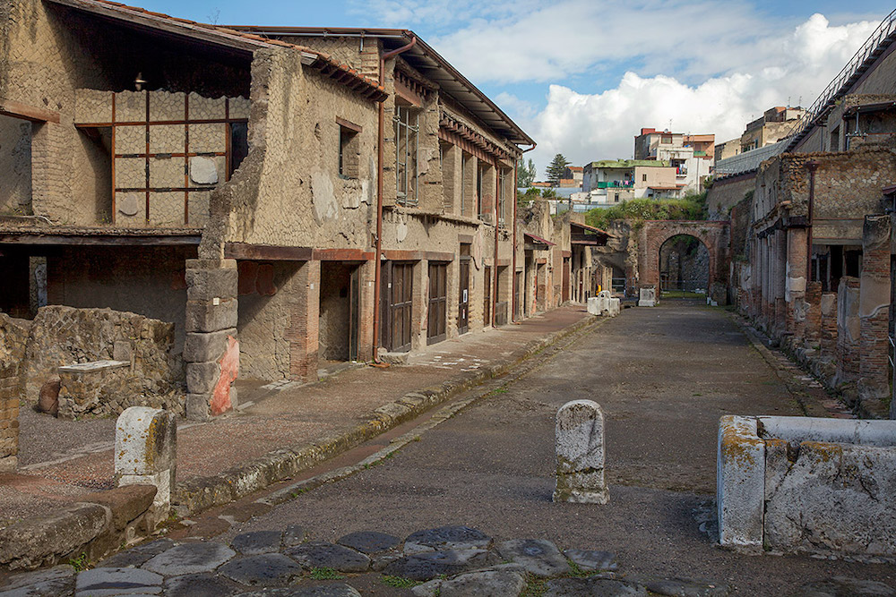
An ancient Roman house has reopened to the public in the archaeological park of Herculaneum, the town near Naples buried by the eruption of Mount Vesuvius in AD79.
Considered the site’s most noble Roman villa, the House of the Bicentenary had been under restoration for 35 years. The three-storey, 600 sq metre domus, which contains stunning frescoes and mosaic floors, was discovered in 1938, 200 years after excavations at the site began, but closed to the public in 1983 after falling into disrepair.
35 years of restoration! I can’t say I particularly remember this building from my visit to Herculaneum nearly a decade ago but it’s one I’d look out for on the next visit. In fact, the main thing I remember from that trip is the walk from the train station down to the site. Blazing sun, no map, winding streets and a couple of wrong turns… that was an experience in itself.
I find it fascinating that there’s still so much yet to be excavated there (and at Pompeii). I mean, yes they’re very large areas and obviously it’s not something that you can rush into with a digger, but nonetheless, there’s so much left to find!

